Tuesday, May 31, 2011

Minimalist Design


I came across some really inspiring and effective ads using a minimalist design approach. They are simple, clean, and surprisingly full of information yet void of junky imagery. The picture above is an ad for Coca Cola with lemon. Here is the link to the page: http://www.noupe.com/showcases/less-is-more-creative-and-inspiring-minimalist-print-ads.html. These ads truly embrace the old adage, "less is more" in their creative and unique design. I thought it would be fun to share, since they truly are impressive. I definitely thought some of them were clever, though I admit some of them were a bit above my head. I enjoy these ads because I try to make my designs simple and straighforward. I think it is important to get the point across as quickly and effectively as possible, and the simpler the better. Especially in advertising, the message has to be pretty obvious to attract and keep attention, which is recently getting much shorter.

Saturday, May 21, 2011

6 Predictions for Digital Advertising in 2011


Jesse Thomas is the CEO and Founder of JESS3, a Creative Interactive Agency. JESS3 designs products and experiences for brands like Google, Nike, Facebook, MySpace, C-SPAN, Microsoft and NASA.

“Likes,” views and followers were all the rage in 2010. Despite the social media community emphasizing engagement instead of reach, media agencies quickly learned that engagement doesn’t scale easily, making it difficult to sell. Enter Facebook, YouTube and Twitter. As consumer use of social media spiked, the leading social networks retooled their advertising products to satisfy the newfound demand from brands. Instead of fizzling out like the popular online communities of yesteryear, they are driving toward profitability after several years of trying to figure out what they wanted to be when they grew up."

"On the flip side, as consumers incorporate social media more into their daily lives, alternatives to the “big three” in the form of niche and location-based social networks have increased in appeal. Advertisers willing to experiment with media campaigns on these networks will have a distinct advantage moving forward as consumers become desensitized to text, display and even rich media ads. Whether they choose to go big or small, the social web equips advertisers with significantly more consumer data points than ever before to improve the targeting and relevance of online advertising."

1. Local Advertising Becomes Relevant Again With Location


"Location-based advertising will continue to grow in 2011 as Facebook expands the technology with its location platform, Places. In addition to Facebook, many other players in the checkin space, including Foursquare, Yelp, Shopkick, and last but not least, Google, will condition shoppers to expect a deal or coupon for alerting friends of their whereabouts. Relevance will distinguish these services from each other as the two biggest players, Facebook and Google, have the most powerful social graph data to customize deals for consumers. Don’t count Groupon out, though. It more than makes up for its comparative lack of technology with brand equity and scale, as its massive sales force will remain dominant in 2011 by further monetizing local commerce beyond the recently launched self-service platform."

2. Silicon Valley Will Be the Next Madison Avenue


"The coolest job in advertising used to be working for an agency in New York City or Chicago, but these days the dream jobs are at Facebook and Twitter. Not unlike Mail.ru Group (formerly Digital Sky Technologies) attracting top bankers from Goldman Sachs, as Facebook and Twitter start generating more revenue, advertising and marketing talent will start heading West to cash in."


3. Influencers Will Be the Celebrities of the Social Web


"Consumers are constantly scouring the social web to decide where to eat, shop and stay; so it comes as no surprise that brands are desperately analyzing Twitter, blog posts and reviews to understand not only who has the largest audience, but how much influence individuals have. YouTube’s Partner Program is being joined by new services such as Klout to create an official layer of social credibility."

"Klout scores are being used by The Palms Hotel in Vegas to gauge discounts for hotel guests, including through the “Klout Klub,” which “will allow high-ranking influencers to experience Palms’ impressive set of amenities in hopes that these influencers will want to communicate their positive experience to their followers.” Creating thoughtful ways to leverage your influencers is the thing to focus on. People have always said it’s cheaper to keep and please the customers you have, than acquire new ones."


4. Small Will Be the New Big for Social Networks

"Despite Mark Zuckerberg’s unwavering belief that an open and connected social web is best for society, early adopters are starting to experiment with new platforms designed to communicate and share media with smaller audiences. Path has shown us the potential of limiting our social networks to 50 people. Fast Society is a new iPhone communication service that allows the user to create small groups to text with on the fly, and the groups last for three days. Facebook also realizes some of us may prefer communicating with smaller networks. Facebook’s new Groups feature allows us to segment our friends into personal, professional and interest-based communities, and openly engage in conversations not meant for our mother or colleagues to hear. Watch for more of these smaller, closed networks to launch in 2011 as people seek deeper connections online."

5. Brands Will Become More Like Media Companies


"Social media has empowered brands to break their own news instead of relying on advertising or PR to disseminate their message. As brands become increasingly comfortable with social media on the whole, more budget and attention will be focused on high quality content created specifically for the social web. We will see more Facebook Pages like Skittles that appear to employ comedy writers to keep the content fresh. It would seem that “a brand’s best bet in social media is randomness.”


6. Facebook “Likes” Will Be Important for Your Brand


"While it’s still unclear exactly how much a Facebook “Like” is worth to a brand, the following video sums up why Facebook is so important."

"Brands will be tripling down on Facebook advertising in 2011, and the process for acquiring Facebook “Likes” has evolved to accommodate this increase in demand. Instead of doing A/B testing between two photos to see which generates more Facebook “Likes,” the savvier brands and agencies are leveraging technology that can simultaneously deploy 10,000+ ad variations to yield the lowest CPA (cost per acquisition) of those “Likes.”


Monday, May 16, 2011

Yet again...


... I was stumbling the internet and came across some pretty funny advertisements. They are vintage style posters advertising current products, including everything from Facebook, to cell phones, computers, and gaming systems. I just thought they were sort of cool to look at, and maybe a bit clever. Nothing I'd really balk at, though they are creative. It's sort of cool to see a juxtaposition of all the technology we have now and how it's advertised, versus what they had 60 or 70 years ago. Imagine getting excited for an improved version of the Hoover vacuum. But in all seriousness, Ads in the 1940s and 1950s had a very definitive and unique style. I can appreciate the effort they must have put into these ads, seeing how much technology has helped me do what I do. I'm not really sure which ones I like best, since they are all pretty fun. But maybe you guys have a favorite!

http://www.hongkiat.com/blog/vintage-advertisement-of-modern-technology/

Sunday, May 15, 2011

THE BRAINSTORMING PHASES OF MY UPCOMING PROJECT

        So, since I am still in the beginning stages of figuring out what I should do for the next advertising project, I am trying to brainstorm a few more ideas before I make a final decision of what I want to do. A recent idea that came to mind that also supports my perspective of my parents not approving of anything I do besides me winning games (like “Monopoly”, “LIFE”, and “Clue”) against my siblings is betting. One person in particular that always encourages me to bet is my dad. I definitely don’t mean to brag (and I’m not trying to jinx myself) but, in my history of betting, I have won more bets that I have lost. Recently, I have been winning with bets that I have been making on the NBA Playoff games. A majority of the bets have been with family members. I feel like this information could also be useful for my project; perhaps this can also be included in my “LIFE” game. I was thinking the title/label on the game board could be “GAMETIME” like the original “LIFE” game has “PAYDAY” on the board. Once again, I am not 100% set on one idea, I am just throwing some ideas out there. Feedback and/or suggestions would be greatly appreciated!

"Life" board game ("MY LIFE" Project Idea)


"GAMETIME" (Let's Go Bulls!)

Tuesday, May 10, 2011

You don't own your brands.


I found this article by the Chief Marketing and Commercial Officer of Coca-Cola and thought that it would be interesting to share.

I found the article through someone that I follow on Twitter, and his preview of the article was:
"Accept that you don't own your brands; your consumers do."

In this section, the writer talks about two different things. First, he mentions that Coca-Cola learned that they don't own their brand when they tried to introduce the New Coke in 1985. This is an interesting piece of information especially if we think about all of the other companies who didn't learn from Coke's mistake. The Gap, for example, angered customers with their logo change recently, and almost immediately went back to what they already had.

But what I think is more interesting is that the paragraph goes on to explain that Coca-Cola's Facebook page, which has more than 25 million fans, was NOT started by Coca-Cola. As the author says, "a decade ago, a company like ours would have sent a 'cease and desist' letter from our lawyer" but instead they now work with the original founders of the page to create new content. I think that's great! I doubt the people who started it were trying to make money (although, that does happen too, with people buying up domain names and then selling them to big companies for profit). They were just Coca-Cola fans who got on the Facebook bandwagon before big companies like Coca-Cola realized that they could really be a huge asset to the brand. I'm glad that Coke didn't make them stop, but instead embraced that their customers truly do understand the brand (perhaps even better than the people branding it) and allowed them to continue.


Although this piece of advice about not owning your own brand is really interesting, especially for an advertising class, the rest of the article is definitely worth reading also. It talks about how we must evolve with the customers and learn to adapt to new ways of running a brand.

Monday, May 9, 2011

Funny ad for awkward product.


In line with my Kotex post, I am interested in the marketing of products that many find awkward to discuss in everyday situations.
Condom advertisements-for the most part- use humor to take the awkwardness out of their product. Many of us have seen Trojan commercials and print advertisements. While I find Trojan's advertising to be humorous- the humor is a bit low brow and is meant to appeal to the masses. In this way I find the humor in the advertising to be semi creative. It doesn't want to take a risk with its humor, it wants everyone to find it funny.

This condom brand, a company named Tulipan, which I had been unfamiliar with prior to finding this advertising strategy, adds tasteful humor to their advertising. Creating a handout that is interactive, witty and intelligent. A large percentage of the population will require the use of condoms at some point of their life. Many people would not like to be marketed as a person having mindless sex. This photograph implies that perhaps the individual as a person with great, put together life and is simply not in the position to procreate.

The reason many use condoms is to prevent procreation- this is not something to be ashamed of. The interactivity of the handout solidifies the idea that the user is making an intelligent decision in the use of their brand's contraceptives. Everyone wants to feel intelligent.

Eastern Inspiration. Western Innovation.

I love this ad. Kyocera’s phone ad has a very interesting look in which has inspired some of my own work. The print ad reads, “We believe that now is a blink. An instant that passes. So we must always be facing forward. Looking for what has not been seen. And while we understand the importance of enjoying the moment, we take greater joy in all the moments yet to come.” I feel like this statement captures the essence of design. I always look for new ideas and ways of communicating to the public that has not been done already. Chapter 11 suggests that a good print ad grabs and keeps your attention, is relevant, and serves as a call to action. And I believe that this ad does just that. It persuades their audience to go out and buy a Kyocera phone while incorporating a flowing visual one can follow through the piece. In the chapter, there is also a breakdown of all the essential parts of a print ad. Kyocera’s ad includes many of the important parts. The sign off at the bottom right is very clever, and it also has the tagline which I think could have been bigger and more noticable. The body text follows the organic image, or product shot, very well. The main visual of the blue man invites you into the image, and helps the audience to identify with Kyocera phones on a more personal level. I also admire structural image at the bottom of the tree. The white space give a kind of minimal feel, but I think that this ad is anything but minimal.


Sunday, May 8, 2011

Cool ad Campaigns


I'M IN FULL BLOG MODE!!

Just wanted to share a link to some pretty neat ad campaigns that I stumbled upon on the internet. By the way, as a side note to anyone who hasn't heard, there is a great web toolbar out there from StumbleUpon.com that literally allows you to "stumble upon" a different website any time you click "stumble". I have it installed and it remembers all your favorite sites (the ones you thumbs up) and sites you hate. You can also instantly share them via Facebook. Just thought I would share with you guys what I mean when I say I "stumbled upon" something on the internet. I use it all the time! Ok, back to the topic. I thought these ad campaigns were cool to look at; check em out! CLICK HERE!

Spoof Ads


Hooray for Harry Potter No. 7 Part 2!! This poster pretty much sums up my feelings. After our first project, I really got big on the idea of spoof advertising. When I stumbled upon this website, I knew it was almost too good to be true. It's on a site called TheShiznit.co.uk. This particular article, if you click the link to view it, has a bunch of advertisements for movies coming out this year that have been modified to "tell the truth". I think some of them are really clever and others are pretty hilarious. It definitely made me stop and think about why these movies are coming out, particularly the new Pirates of the Caribbean movie... (that one still blows my mind, but I guess everything really is about money). I thought I would share these, even though we have already passed the spoof ad project. I guess now I can better appreciate the artistic intellect that someone put into making these. Here are some of my favorites, but I pretty much love them all!

Saturday, May 7, 2011

Smell Like a Man, Man


So everyone knows those Old Spice commercials that are currently running. I stumbled upon a comical image made with Minecraft:


Apparently this is a game where you can build anything you want out of cubes. I just thought this cartoon was hilarious because I'm so amused by those Old Spice commercials (and not just the fact that the dude is drop-dead sexy). They really are clever and they're one of my favorite commercials on the air. I have seen only a few that I find myself thinking "this is a good commercial". So when I came across this cartoon, I just had to laugh. Nice spoof.

Advertising Becomes Personal with Billboards that See You


Thought this article that I found was very interesting.

"We live in a “me” society, where everything is on demand, and customized and personalized just for me. I have MySpace, iGoogle, my Yahoo, my iTunes – everything directed towards me, in the way I choose to consume it. I no longer read a print newspaper; instead I simply log onto my Google desktop, and can see my top interest news, specifically in the way I have decided to filter it, and specifically in the order I want it displayed. I no longer listen to the radio, I play my iTunes, which are songs I have chosen to listen to, or Pandora, with specific radio stations created just for me, based on the music I want to hear. I no longer buy shoes at a regular store; instead I use an online company that puts together a customized selection of shoes just for me, based on my personal tastes. I have decided that I am important enough to only consume exactly what I want, and have thus managed to filter out most of the “noise” that exists in the world."

"It only makes sense that advertising and marketing will follow this trend in focusing on the “personalized for me.” Random ads directed at mass consumers may no longer be as effective, now that consumers are used to having everything else customized specifically for them."

"While there has been much debate in the past over your online privacy – a new debate may soon exist that can be taken to the streets, in the form of billboards."

"A system was very recently developed by a research agency in Singapore. The system consists of a billboard-like electronic screen that has cameras and sensors that can actually “see” passersby. The screen can detect the gender of the passersby, as well as exactly how long the “audience” looks at the billboard. The system will soon be able to detect your age as well. IBM is currently working on a system that will be able to scan a crowd, estimate the number of people in the crowd, as well as the demographics of the crowd, and exactly where the crowd is looking."

"Taking this new technology a step further, there is much to come just on the horizon. These systems will soon be able to detect logos on cups and shopping bags of passersby, and then display relevant ads to each person. These “relevant” ads could either be to reinforce the brand they are using, or to display an ad of a competitor of the brand."

"Albeit a bit creepy to have a screen know my age, gender, and what I am having to drink, what an amazing way to customize and tailor messages just for me."

What do you think about these billboards?

Wednesday, May 4, 2011

Top 10 Viral Video Ads (of the week!)


http://www.visiblemeasures.com/adage

I stumbled upon this website while looking for something else, and thought it would be worth sharing on this blog. Updated on Thursday mornings, it's a Top 10 list of Viral Video Ads.


Here's what THEY say about it:

"The Visible Measures Top 10 Viral Video Ad Campaigns Chart focuses on brand-driven viral video ads that appear on online-video-sharing destinations. Each campaign is measured on a True Reach™ basis, which includes viewership of both brand-syndicated video clips and viewer-driven social video placements. The data are compiled using the Visible Measures Viral Reach Database, a constantly growing repository of analytic data on more than 100 million internet videos across more than 150 video-sharing destinations. Note: This analysis does not include Visible Measures' paid-placement (e.g. overlays, pre-/mid-/post-roll) performance data or video views on private sites. This chart does not include movie trailers, video-game campaigns, TV show or media network promotions, or public service announcements. View-count results are incremental by week."


So basically, they focus on 10 online ads that reached sometimes millions of people just through the internet. (The #1 this week is a T-Mobile ad that reached over 8,000,000!)

We all know that the internet is a great way for things that would otherwise be completely overlooked or insignificant to become instantly popular (i.e. Friday, Charlie Bit Me, among others) but it works for advertisements too! What is so interesting to me is that these advertisements really wouldn't work (some of them, I personally think the T-Mobile one is included) for TV. They only work because they're out there on the internet. Something to keep in mind as we design for multiple mediums!a

The Evolution of Coca-Cola


The great debate: Coke vs. Pepsi. No doubt they are both raking in MILLIONS for their respective founders, but Coke has been a symbol of a generation since it's classic curved design in 1915. I'm a Coke-drinker by nature (some say it's a southern thing, and no we don't call it POP). Not only do I love it's flavor, but the evolution of Coca-Cola in advertising is also something to revere. I came across this website: http://www.designers-magazine.com/?p=542 that chronicles the history of the soft drink's advertising campaign. Most recently, Coke got some television time when the Myth Busters guys dropped a Mentos candy into a 2-liter of Diet Coke and made an explosive discovery.

As it stands now, the Coca-Cola logo is pretty much universally recognizable and enjoyed by millions all over the world. Most recently, the company has adopted a more modern vectorized and loses everything but the name. Simply the white and red line are also instantly associated with the brand. I would say they've done a pretty good job embedding the product into our brains!

Friday, April 29, 2011

Unconventional Advertising


In Chapter 15, it talks about unconventional advertising. Unconventional advertising “ambushes” the public, it appears in public or private environments - places and surfaces where advertising does not usually live. Context is important and unconventional advertising can make people notice - that is, it can break through to consumers in ways that traditional ads do not or can not, and it might garner free publicity from the news media. Often, clients and agencies turn to unconventional marketing when the budget is too low for television or for rich Web solutions. The underpinning hope is that a terrific unconventional solution will garner free attention from the press.


There are basic questions to ask when you create unconventional advertising:

  • What is the goal? Why would you employ unconventional marketing rather than conventional or screen media?
  • What will the audience get out of it? Something worthwhile?
  • Since unconventional advertising intrudes in non-paid media space, will it be more beneficial that annoying?


Here is a site I found with different examples of unconventional advertisements.


http://www.boston.com/business/gallery/quirkyadvertisements?pg=11

Thursday, April 28, 2011

Importance of Platforms and Owned media for advertising

Chapter 13 discusses the importance of website making and the different components that go into making a successful website. One of the most important aspects of a website is how it attracts and audience and how this is the one form of advertising that the audience member can relay back to at any point in time. This is the main concept of the platform and the idea of having owned media through websites. The book states that " unlike outbound advertising or a campaign that runs for a period of time in various media, a platform is owned media rooted in utility and built to last, offering a constant connection." The most important idea out of that entire quote is the idea of offering a constant connection. This makes what ever the advertising is more versatile to a wider range of audiences because the ad/ brand is available any where at any time allowing for a greater out reach. It is also very important for the website to be memorable and interactive in order to truly grasp the attention of your audience. This can be seen in website posted below. This website show cases their brand while allowing the audience member to navigate their site in a new and excited way making it so much more memorable than just a regular website that does not speak out in any interesting way . Website is blitzagency.com

Web Site Advertising- Product Promotion


While reading Chapter 13 "Designing Web Sites" I was reminded immediately of the interactivity of children's toy and television web sites. One in particular Disney's Club Penguin
http://www.clubpenguin.com/ really seems to have a hold on some of the younger children I know.

The youth market is quite important in advertising. A substantial amount of money is spent on children in the United States every year. However, with thousands of games and toys- kids aren't just swayed by anything bright and flashy that comes their way.

For example, Club Penguin is a television show that is not broadcasted all day everyday. The series and ultimately Disney's goal is to keep their show on the mind of the viewer as often as possible.

Though Club Penguin's site is not as flashy as some interactive sites, the site is primarily a game. It looks like a game and it does not extensively endorse the show or other products. Kids and Parents are not stupid. Parents do not want their child bombarded with advertisements and kids just want to play. This site allows children to create an account and play Club Penguin themselves. This is engaging the visitor and creating brand loyalty as the child is more likely to log on again to continue playing or watch the television show more often as they are more familiar with it.

The site is very unassuming but I believe very powerful in creating brand recognition and loyalty.

Levi's Eye-Catching Out of Home Ads


Chapter 11 discusses the elements of print advertisements. When designing outdoor print advertisements it is important to create an ad that quickly grabs attention and can be seen and understood from a distance. The billboard must support the television and print advertising campaign and location in a crucial factor to consider when launching a billboard campaign.

Levi's 501 billboard campaign certainly eye-gabbing and memorable. The billboard was simple, it only contained 3 elements of a traditional print ad. The billboard was solid read with the headline 'Levi's 501', a call to action of the store location in the closest proximity, and most importantly a large three dimensional image of the classic Levi's 501 style jeans. The jeans appeared to be worn by the billboard and the signature fly was unbuttoned to reveal the headline. The billboard grabbed passerby's attention with a sexually suggestive image with realistic, larger-than-life appearance.

The billboard advertisement is successful because it does not fall into Sal De Vito's 6 categories. The limited copy in the ad does not sound sale's pitchy, or like bullshit, and it is easy for the audience to read when quickly passing the billboard. The imagery is edgy- not too cute. The billboard certainly stood out amongst competition and had not been done before.

Wednesday, April 27, 2011

Funny Ad


I thought that this Brazilian Ad was hilarious! This new campaign from Brazil for Forum Jeans depicts models beating up government officials, illustrating its feelings towards the country's government. I think it successfully communicates a specific story to its audience. I also admire that it grabs the audience’s attention right away. Many people don’t agree with the decisions that the government makes. I guess in these jeans, you will have the power to fight back. I was a little confused about the mud though. Is the Ad implying that these government officials are knee deep in mud? Or something else? ☺
It reminded me of the Levis Ad on page 205, Chapter 10, in the book. I like the minimalistic aspect of the ad as well as the interchanging of different animal material rugs at the bottom. It has a very crafty look in morphing two people together to communicate that men and women both can now where these jeans. However, with the text I get a sense of ‘one size fits all’ even though I know that is not what they were going for. Because the people change in each frame, I think the size 5 01” should as well. Who wouldn’t want those jeans after seeing this ad?!

Tuesday, April 26, 2011

Memory & Image


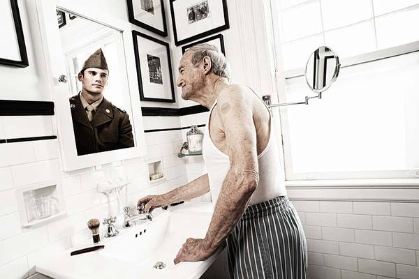
The section in Advertising by Design focusing on image and text made me think of the power of a textless image. If an image is strong by itself with no mention of the product it is advertising it will surely pack a stronger punch once the copy is added to the work. This series of images done by photographer Tom Hussey for a product called Exelon which is a patch used to treat memory loss and other early signs of Alzheimer's. When selecting or creating images for a campaign I think the quality and interest of the image alone is something to consider. The concept of memory loss in early alzheimer's is often connected to a confusion or incident such as misplacing items and being lost. I feel these images are so beautiful in illustrating the way that the elderly see themselves and how this product can help them remember memories of their lives as opposed to remember to take a medication or turn off the stove.

To see the rest of the images visit The Beautiful Life Blog.

Type adds dramatic effect

Chapter 12 discusses the designing for motion, broadcasting and broadband. Often the commercials you see on television come in multiple time frames and can be viewed on the web. One commercial shot can be used for a variety of medias. I typically do not watch television with commercials, I’ve bought into new technology and finds to watch my favorite shows and avoid all those commercials. If I am watching live tv and stop for a commercial it must be fairly catching for me to stop. Similarly I find that men are notorious for switching during commercials. “Why watch a commercial when I can watch that other game that’s on?” Which makes sports commercial even more difficult to get viewers to watch. One of my favorite commercials/campaign is NHL History will be made. I can tell this commercial in particular was effective when my father (who always watches golf during commercials) stopped to watch this commercial.

http://www.youtube.com/watch?v=Ujaqq8GzXXc&NR=1

The commercial uses previously recorded home movies of to tell a story. Also, their use of small text is well used to guide the story form beginning, middle and end. The type works well between motion and heightens the dramatic effect of the commercial.

TV Advertisements

Before I was in the graphic design department, I started out in CDM's Digital Cinema. At one point, I really wanted to create movie trailers, and possibly even commercials. Since the cinema department was more focused upon movies themselves, I moved to graphic design. The interesting part of this reading for me was chapter 12 about designing for motion, broadcast, and broadband. In particular, this reading reminded me of TV advertisements that I have been particularly interested in, including the Miller Lite advertisements that are done in the style of e-Harmony's/Match.com's advertisements.

If you haven't seen them, here are a few:
http://www.youtube.com/watch?v=BXXgBU_bS7A

http://www.youtube.com/watch?v=4orc-bHYLxo


The thing that I find particularly interesting about these actually relates directly to what the book discusses on page 218 - TV and Web commercials have to do the following in 15-30 seconds: "Get someone's attention before he or she zaps, skips ahead, or leaves the room." The first time I saw one of these commercials, I almost skipped it because it was just another one of those dating site advertisements. However, there was something about it - something different enough - that kept my attention and allowed them to get the entertainment part of the commercial across. This works well for other reasons also - this commercial, for example, is supposed to be geared towards men it seems, but women might stay around and watch the commercial thinking it is something else. It works both ways.

Amazing Ads

Chapters 11 through 15 discuss different forms of advertising and how to create them effectively for various media platforms. In print media, for example, the ad has to be eye-catching to attract initial attention and interesting enough to keep it. Billboards are a very common form of print advertising in large scale. People usually are passing them pretty quickly on the road, so they need to be informative and attractive. McDonald's used the above ad in Chicago in 2006. What makes it interesting is that it mimics a sundial, using the iconic golden arches. It's informative because it shows all the different food options McDonald's offers in the morning, like coffee, McMuffins and pancakes. I think it is a pretty clever use of this type of media because it is pretty much the only format large enough to make something like this effective. Also, because of it's placement it is high enough to catch the sun without being blocked and colorful enough to grab people's attention. Also there is very little text so people driving by do not have to read anything to know what's being advertised.

This billboard advertises Penline Tape, and actually won an award in 2007. It also needs no words to tell people what their product does. Apparently, it is so strong it can hold up a billboard! Something that is straightforward and obvious makes for a compelling advertisement because people know immediately what the message is. As a large format media, this ad works quite well because of its simplicity in image, text, and color.

More pictures and facts on:
http://weburbanist.com/2010/01/11/creative-billboard-advertising-campaigns/

Things to Keep in Mind After Reading the "Advertising by Design" Book

Chapters Eleven through Fifteen have very resourceful information regarding tactics that will ensure the success of various forms of advertisements (web, mobile, television, films, and etc.). Some tips that were necessity to remember discussed the importance of the headline and visual elements in the campaign or design should communicate and express the advertising message together. The quality of typography and color choices also need to be taken into consideration when applying design principles such as: balance, unity, visual hierarchy, rhythm, flow, and/or contrast.

With the previous statements in mind and after reading and reviewing all of the chapters in the book, Advertising by Design, it shows how dependent we have become on modern technology. Small devices like cell phones and I-Pods have a big impact on our lives. They appear to be more popular than laptops and computers right now; pretty soon we will not need a laptop because everything will be able to be done on cell phones. Even I-Pads are becoming a new commodity these days. Designers and businesses know this so they keep this in mind when producing certain products in regards to promoting and advertising to their target audience by using a media (or medium) that will grab the most people’s attention (ex: consumer accessibility on the web). All of this is a little overwhelming because it just makes me think what else can they come up with that will be more popular than the I-Phones or I-Pads.


Sunday, April 24, 2011

Kotex rebranding

Ever find feminine product commercials weird and awkward to watch? Many of us women go to that aisle of the drug store, grab something quickly, and pay for our products without making eye contact with the cashier. Men- this is a subject that many of you shudder to think about.

Marketing and advertising products that are a necessity to nearly half of the population, but are rarely talked about may prove to be a challenge for creative staff. Kotex has recently undergone a rebranding of their product line and advertising techniques. One part of this rebranding is a campaign (coordinated ads) that make talking about periods and feminine products.

These commercials grab the viewers' attention because of the "real" communication qualities. They are trying to be honest about the product they are trying to sell, fully recognizing it is an awkward subject for most people to talk about. Like the Mark Twain quote from the book "When in doubt, tell the truth." (Page 193). These ads are open and honest about the fact that they are trying to sell an awkward product. The second commercial in particular points out the advertising and market research techniques that many are aware of. They address the fact that women and young people are smart- they know they are being marketed to. This technique is similar to the Dove Campaign for Real Beauty mentioned in the reading, which addressed the problems within the advertising field marketing to the same audience.

This campaign can be easily effective because it has the potential to enter the pop culture vernacular. This campaign has the potential to make the discussion of menstruation and feminine products more regular and normal- since it is presented to us as a normal occurrence.

I think this is an effective campaign because of its unique approach that addresses the real feelings of the viewer when seeing ads about this uncomfortable topic. It challenges the advertising techniques of its competitors- showing the consumer respect for their intelligence and willingness to communicate on their level. The ads are simple and written wittily.

REALITY CHECK
http://www.youtube.com/watch?v=lpypeLL1dAs

WHY ARE TAMPON ADS SO OBNOXIOUS?
http://www.youtube.com/watch?v=QOM4AMV050A&feature=related

Saturday, April 23, 2011

Text as Image

I was really interested in the aspect of typography and design. I myself have always had a particular passion for typography and feel that using words as an image to portray an idea is an exceptionally unique way of advertising. I have found that most advertisements that speak out to me are those that involve type but use it in an unexpected way. This is especially important when advertising that one grabs the attention of their audience and especially in a way that is memorable. Most ads include text and image together but I feel that it is rare to see the text becoming the image and overall being the attention grabber of the entire ad. This is relevant to my life wanting a career in producing ads or designing layouts for magazines because I feel the more use you can get out of the type that you are working with the better. It is important to create an overall balance through the ad and sometimes using both text and image together can be overpowering in an ad. One must note that these two need to work together and not against each other in order to create a successful ad. This type can be seen in the ad produced shown here by Paula Scher.

Thursday, April 21, 2011

Fruit Juice

I came across these juice boxes on the web at Trendland.com and I thought they were so clever! I love packaging that actually looks like what is inside it. I think these juice boxes also make a statement about the product--that is as close to the real thing as you can get. This sort of packaging makes it simple for people to know what they are getting, for example strawberry or banana juice. It is a smart move to have the outside of the package reflect the inside, so there is no room for confusion. Advertising by Design talks about making things simple for people so there are no surprises. People like to know what they are buying, and in this case they have some clue right from the start. I also think the little strawberry and kiwi boxes are cute because they are even textured to resemble the fruit. I think it makes a statement about the quality of the product that would appeal to mothers who don't want their kids to have too much high fructose corn syrup or sugary "fruit flavored" juices. Smart packaging can help people make smarter decisions about their food purchases, and ultimately smarter lifestyle choices.

Subverting Denotation of Images with Text


Barbara Kruger is best known for her text-driven images. Her advertisements juxtapose bold type highlighted in red over simple black and white photographs. Kruger’s untitled advertisement from 1990 shows a woman looking through a magnifying glass. The text is positioned above and below the woman’s face and reads, “It’s a small world… but not if you have to clean it.” From the combination of text and image used, I gather that Kruger is making a commentary on gender roles and societal expectations. The woman’s right eye is distorted, appearing much larger than her left as she peers through the magnifying glass at the viewer. I think Kruger’s message is intentionally ambiguous in that it is intended to make the viewer question what he or she is seeing. In actuality, is the woman’s eye disproportionately larger than the other? Is it really a small world? Who is responsible for cleaning it? This sort of subjective questioning is precisely the aim and focus of Kruger’s work. It seems that Kruger treats photographs and letters as puzzle pieces that she arranges in ways to challenge the viewer.

Threadless

In chapter 15 it discusses the designing aspects that go into designing for social media as well as for unconventional marketing ideas. In understanding how to apply marketing concepts and combining them with social media, the book points out that the marketing is most effective when it is relevant, authentic, valuable, enticing and shareable. A company that I thought that would be interesting to look at that uses social media in their marketing is the company Threadless. This company is also a great example of brand love and brand idea that is discussed in chapter 4. Threadless t-shirt company is not just seen as a company but is also viewed as a community due to how each week it has designers submit their designs and people vote for their favorite. In chapter 15 it mentions that "people become brand fans when they can relate to what a brand or group is doing in their social space. People do not relate to a brand represented by just another ad interjected into their web space. It had to be something engaging and fun.” Threadless creates a fun interactive way of being in peoples social spaces such as facebook and twitter. In an article I found it mentioned “Threadless’ didn’t do any type of advertising for the first 8 years they were in business. Their community did the work for them. Threadless is built almost entirely on word-of-mouth marketing, and it is through powering their community that they continue to thrive.” This is a perfect example of how getting the brand name out there and building a community that loves the bran and basically advertises the company.

Back a while ago Threadless created a concept where users could nominate and vote for a Twitter messages that would then be made into shirts. This type of interaction allowed for anybody to participate, which opened up the community of Threadless even more.

Below are some interesting links and a video that I found about Threadless:

http://www.adweek.com/news/advertising-branding/threadless-sell-twitter-tees-99324

http://www.trada.com/2010/05/threadless-social-media-marketing/

http://www.socialmediabiz.com/resource/video-threadless-on-building-brand-love-through-social-media

Simple Forms Create Iconic Images


The image above shows how masterful use of line and shape easily creates an image in our mind. As many would guess, this ad compares the likeness of Charlie Chaplin to Adolf Hitler with the use of 3 simple shapes. Chapter 9 was primarily about composition, and mentioned the use of the gestalt principles to influence how your composition is perceived. The advertisement above uses the principles of proximity and similarity to show how both characters are the same yet different, leading to the tag line "It's the hat"

I think the ad is effective in getting the point across that a hat says a lot about your personality and maybe on a higher level, the way you dress in general. I don't know how well the ad affected Hut Webber Hats, but it did draw a lot of attention to the company as this ad was widely circulated on the internet.


Chapter 10 begins introducing factors one must be aware of when composing an advertising campaign. Pepsico's Quaker Oats launched an ad campaign titled 'Go humans go' in Spring of 2009. The campaign spanned over TV, print, online, and outdoor media channels. The distinct core idea carried through each medium was the idea that Quaker Oats products were 'Super foods' and their nutrients provided humans with physical and emotional energy.

The campaign aimed to entertain as well as communicate a positive message amongst a time of economic turmoil. The headline 'Go humans go' acted as a cheerleader to for the audience to persevere through financial hardships. Audiences could make a emotional connection with the campaign and viewed Quaker products as more than food, but a dose of hope and optimism.

I think this campaign was successful because it communicated the same underlying message through different stories and to different audiences and it also changed the previous opinions of Quaker Oats as a boring oat product. For example, the print ad (shown above) targets working professionals. It says that Quaker Oats is the breakfast item that is easy, nutritious, and will give you that push throughout the day.

The television ad (also posted above), targets children and parents. The television advertisement communicates that Quaker is the fun and easy food that gives you energy to play and learn.


Storytelling

Telling a brand or groups story can be difficult in the small amount of time it takes to grab the viewer’s attention and engage the viewer to continue the interaction. Chapter 10 explains how storytelling is used to communicate related messages that, over a period of time, will distinguish differentiate, reflect positively, construct or contribute to its brand personality, be memorable (stick), resonate and influence people. Developing the story can be the most difficult task because in a media-dense society, most people don’t care or take the time to be influenced by advertising. Storytelling generation can be created by thinking “What if?” What if you needed to get to New York in 12 hours? What if wanted to get the knot out of your hair? What if you needed to know what time it was? These what if questions create frame problems that consumers have and brands can be apart of the solution. An example of such is “what if you needed an organ?” Advertising for organ donation is difficult and can end up being sort of cheesy. This commercial is to gain organ donors and features a good example of storytelling (warning: it might make you cry). Although this commercial was from Brazil, the story is strong enough that it can be understood by anyone.


http://www.youtube.com/watch?v=tAIaAjUenDY&feature=related

Wednesday, April 20, 2011

Chapter Eight Analysis

According to the information that was addressed in Chapter Eight, Typography and Visualization, typography is based on denotation (the literal meaning of words) and connotation (the meaning suggested by the designer’s relationship with the images). Typography can be used as display type (ex: titles, headlines, and headings) and/or body copying (ex: paragraphs, captions, and columns). With this previous information in mind, a designer should always judge the spacing optically, which will help the designer in adjusting the spacing of individual characters. For selecting the right typeface to use, certain criteria to consider are: ideas, content, target audience, image integration, and context and media.
In addition to selecting the right typeface, the designer should restrict his/her designs to no more than two or three different typefaces. With this in mind, typefaces should be mixed if they have similar skeletal structures (ex: Old Style Roman with Humanist) and/or character of shape (ex: geometric with mechanical, slab-serif). Weight contrast, width, and/or style are also appropriate reasons for mixing and contrasting type. Suitable typefaces, along with the consideration of size, spacing, margins, and color, contributes to readability of the client and/or target audience.
According to the book, the various ways to portray images are: notations, pictographs, silhouettes, light and shadow, contour, volume, lineation, expressionism, high contrast, and naturalism. The various categories of images are: illustration, photography, collage, graphic design, photomontage, motion graphics, diagrams, and mixed media. In my opinion, Chapter Eight was very resourceful in terms of addressing the useful ways of creating type and visual elements for a successful design.


(Barbara Kruger's designs are successful in terms of selecting type and visual elements for a specific piece of work)

Evian Babies


After reading, I was really interested in the campaigning.

"Evian’s Live Young campaign was sprung in France, the UK, Belgium, Canada, the US, and Japan with an imaginative campaign that makes you chuckle - who would expect a gang of rollerskating toddlers with “attitude” to be showing us that Evian water invigorates the body? These babies toe-tap to rap music, break-dance to the beat, and perform rollerskating tricks - all to make the point that natural, pure water supports youth! I am not a fan of talking babies (in either movies or ads), but this ad over-comes the cliché of talking babies by having them do something other than talk which, after all, is not that exciting, or even creative. In fact, these babies do not talk at all. Instead, we are immediately engaged at the start of the commercial by the unexpected view of a “tough guy,” (very cute), rollerskating clad toddler, rhythmically tapping his toes and moving to the beat of a rap song. The unexpected scene and music raises our interest as we curiously enter into the playful world of Evian babies that captivates us with their playful grins as they boogie to a RAPPER’S DELIGHT remix, (hiphop artist Dan the Automator)."

www.youtube.com/watch?v=XQcVllWpwGs

Evian has just recently added to its baby and youth campaign with this viral video.

www.youtube.com/user/EvianBabies


A tasty use of text

Part of this week's reading dealt with type and visualization. A section in chapter 8 that stood out to me in particular was the integrating type and image section. In it, the section provided important reminders when integrating the two. Important ideas ranged from emphasis, contrast, similar characteristics, and how the two will interact. These ideas are very important to remember when pairing image and text. There really should be some sort of marriage between the two, be it one of shared characteristics or one of contrasting characteristics for example.

1992_absolut_twist_ad.jpg


Absolut Vodka has had a pretty standard ad campaign for a while now (at least for as long as I can remember). This particular example shows a relationship between image and text. The text on the bottle shows both a sans-serif font and a script font. Those two fonts pair well together because of their extreme contrast. Similarly, the larger sans serif at the bottom pairs well with the leaves and fruit surrounding the bottle. Here again, the two work together because of their contrasts. The straight lines in the text contrast with the curves in the leaves and fruit. Plus it's pretty tasty too!

Tuesday, April 19, 2011

Campaigns - Mayhem

I really liked the discussion in this reading about campaigns and how they're tied together - either by look, feel, voice, tone, style, imagery, or the tagline. The examples in the book were good, but I personally am a huge fan of Allstate's Mayhem campaign. I can't find a picture of it, but if you're ever at the corner(s) of Fullerton, Elston, and Damen right by campus, there is one of the ads that says "6 Corners? That's Mayhem." It fits in perfectly with their campaign (which you can find an example of it here if you haven't seen it before: http://www.youtube.com/watch?v=5-Sjld5yy3Q). They also have it in print campaigns (like the one near campus at Fullerton/Elston/Damen) that have this look and feel:


The nice thing about this campaign is that even though they're all unified by look and tagline ("Dollar for dollar, nobody protects you from Mayhem like Allstate") and the videos are all unified by the "Mayhem" character (also with that tagline), each one caters to a different audience. For example, there's one about a teenage boy driving and "Mayhem" is a girl jogging. Then there's one about "Mayhem" being the snow on the roof. They're all distinct and unique, but they all fit together to form one cohesive and memorable campaign for Allstate.