Friday, April 29, 2011

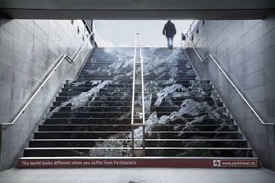
Unconventional Advertising


In Chapter 15, it talks about unconventional advertising. Unconventional advertising “ambushes” the public, it appears in public or private environments - places and surfaces where advertising does not usually live. Context is important and unconventional advertising can make people notice - that is, it can break through to consumers in ways that traditional ads do not or can not, and it might garner free publicity from the news media. Often, clients and agencies turn to unconventional marketing when the budget is too low for television or for rich Web solutions. The underpinning hope is that a terrific unconventional solution will garner free attention from the press.


There are basic questions to ask when you create unconventional advertising:

  • What is the goal? Why would you employ unconventional marketing rather than conventional or screen media?
  • What will the audience get out of it? Something worthwhile?
  • Since unconventional advertising intrudes in non-paid media space, will it be more beneficial that annoying?


Here is a site I found with different examples of unconventional advertisements.


http://www.boston.com/business/gallery/quirkyadvertisements?pg=11

Thursday, April 28, 2011

Importance of Platforms and Owned media for advertising

Chapter 13 discusses the importance of website making and the different components that go into making a successful website. One of the most important aspects of a website is how it attracts and audience and how this is the one form of advertising that the audience member can relay back to at any point in time. This is the main concept of the platform and the idea of having owned media through websites. The book states that " unlike outbound advertising or a campaign that runs for a period of time in various media, a platform is owned media rooted in utility and built to last, offering a constant connection." The most important idea out of that entire quote is the idea of offering a constant connection. This makes what ever the advertising is more versatile to a wider range of audiences because the ad/ brand is available any where at any time allowing for a greater out reach. It is also very important for the website to be memorable and interactive in order to truly grasp the attention of your audience. This can be seen in website posted below. This website show cases their brand while allowing the audience member to navigate their site in a new and excited way making it so much more memorable than just a regular website that does not speak out in any interesting way . Website is blitzagency.com

Web Site Advertising- Product Promotion


While reading Chapter 13 "Designing Web Sites" I was reminded immediately of the interactivity of children's toy and television web sites. One in particular Disney's Club Penguin
http://www.clubpenguin.com/ really seems to have a hold on some of the younger children I know.

The youth market is quite important in advertising. A substantial amount of money is spent on children in the United States every year. However, with thousands of games and toys- kids aren't just swayed by anything bright and flashy that comes their way.

For example, Club Penguin is a television show that is not broadcasted all day everyday. The series and ultimately Disney's goal is to keep their show on the mind of the viewer as often as possible.

Though Club Penguin's site is not as flashy as some interactive sites, the site is primarily a game. It looks like a game and it does not extensively endorse the show or other products. Kids and Parents are not stupid. Parents do not want their child bombarded with advertisements and kids just want to play. This site allows children to create an account and play Club Penguin themselves. This is engaging the visitor and creating brand loyalty as the child is more likely to log on again to continue playing or watch the television show more often as they are more familiar with it.

The site is very unassuming but I believe very powerful in creating brand recognition and loyalty.

Levi's Eye-Catching Out of Home Ads


Chapter 11 discusses the elements of print advertisements. When designing outdoor print advertisements it is important to create an ad that quickly grabs attention and can be seen and understood from a distance. The billboard must support the television and print advertising campaign and location in a crucial factor to consider when launching a billboard campaign.

Levi's 501 billboard campaign certainly eye-gabbing and memorable. The billboard was simple, it only contained 3 elements of a traditional print ad. The billboard was solid read with the headline 'Levi's 501', a call to action of the store location in the closest proximity, and most importantly a large three dimensional image of the classic Levi's 501 style jeans. The jeans appeared to be worn by the billboard and the signature fly was unbuttoned to reveal the headline. The billboard grabbed passerby's attention with a sexually suggestive image with realistic, larger-than-life appearance.

The billboard advertisement is successful because it does not fall into Sal De Vito's 6 categories. The limited copy in the ad does not sound sale's pitchy, or like bullshit, and it is easy for the audience to read when quickly passing the billboard. The imagery is edgy- not too cute. The billboard certainly stood out amongst competition and had not been done before.

Wednesday, April 27, 2011

Funny Ad


I thought that this Brazilian Ad was hilarious! This new campaign from Brazil for Forum Jeans depicts models beating up government officials, illustrating its feelings towards the country's government. I think it successfully communicates a specific story to its audience. I also admire that it grabs the audience’s attention right away. Many people don’t agree with the decisions that the government makes. I guess in these jeans, you will have the power to fight back. I was a little confused about the mud though. Is the Ad implying that these government officials are knee deep in mud? Or something else? ☺
It reminded me of the Levis Ad on page 205, Chapter 10, in the book. I like the minimalistic aspect of the ad as well as the interchanging of different animal material rugs at the bottom. It has a very crafty look in morphing two people together to communicate that men and women both can now where these jeans. However, with the text I get a sense of ‘one size fits all’ even though I know that is not what they were going for. Because the people change in each frame, I think the size 5 01” should as well. Who wouldn’t want those jeans after seeing this ad?!

Tuesday, April 26, 2011

Memory & Image


The section in Advertising by Design focusing on image and text made me think of the power of a textless image. If an image is strong by itself with no mention of the product it is advertising it will surely pack a stronger punch once the copy is added to the work. This series of images done by photographer Tom Hussey for a product called Exelon which is a patch used to treat memory loss and other early signs of Alzheimer's. When selecting or creating images for a campaign I think the quality and interest of the image alone is something to consider. The concept of memory loss in early alzheimer's is often connected to a confusion or incident such as misplacing items and being lost. I feel these images are so beautiful in illustrating the way that the elderly see themselves and how this product can help them remember memories of their lives as opposed to remember to take a medication or turn off the stove.

To see the rest of the images visit The Beautiful Life Blog.

Type adds dramatic effect

Chapter 12 discusses the designing for motion, broadcasting and broadband. Often the commercials you see on television come in multiple time frames and can be viewed on the web. One commercial shot can be used for a variety of medias. I typically do not watch television with commercials, I’ve bought into new technology and finds to watch my favorite shows and avoid all those commercials. If I am watching live tv and stop for a commercial it must be fairly catching for me to stop. Similarly I find that men are notorious for switching during commercials. “Why watch a commercial when I can watch that other game that’s on?” Which makes sports commercial even more difficult to get viewers to watch. One of my favorite commercials/campaign is NHL History will be made. I can tell this commercial in particular was effective when my father (who always watches golf during commercials) stopped to watch this commercial.

http://www.youtube.com/watch?v=Ujaqq8GzXXc&NR=1

The commercial uses previously recorded home movies of to tell a story. Also, their use of small text is well used to guide the story form beginning, middle and end. The type works well between motion and heightens the dramatic effect of the commercial.

TV Advertisements

Before I was in the graphic design department, I started out in CDM's Digital Cinema. At one point, I really wanted to create movie trailers, and possibly even commercials. Since the cinema department was more focused upon movies themselves, I moved to graphic design. The interesting part of this reading for me was chapter 12 about designing for motion, broadcast, and broadband. In particular, this reading reminded me of TV advertisements that I have been particularly interested in, including the Miller Lite advertisements that are done in the style of e-Harmony's/Match.com's advertisements.

If you haven't seen them, here are a few:
http://www.youtube.com/watch?v=BXXgBU_bS7A

http://www.youtube.com/watch?v=4orc-bHYLxo


The thing that I find particularly interesting about these actually relates directly to what the book discusses on page 218 - TV and Web commercials have to do the following in 15-30 seconds: "Get someone's attention before he or she zaps, skips ahead, or leaves the room." The first time I saw one of these commercials, I almost skipped it because it was just another one of those dating site advertisements. However, there was something about it - something different enough - that kept my attention and allowed them to get the entertainment part of the commercial across. This works well for other reasons also - this commercial, for example, is supposed to be geared towards men it seems, but women might stay around and watch the commercial thinking it is something else. It works both ways.

Amazing Ads

Chapters 11 through 15 discuss different forms of advertising and how to create them effectively for various media platforms. In print media, for example, the ad has to be eye-catching to attract initial attention and interesting enough to keep it. Billboards are a very common form of print advertising in large scale. People usually are passing them pretty quickly on the road, so they need to be informative and attractive. McDonald's used the above ad in Chicago in 2006. What makes it interesting is that it mimics a sundial, using the iconic golden arches. It's informative because it shows all the different food options McDonald's offers in the morning, like coffee, McMuffins and pancakes. I think it is a pretty clever use of this type of media because it is pretty much the only format large enough to make something like this effective. Also, because of it's placement it is high enough to catch the sun without being blocked and colorful enough to grab people's attention. Also there is very little text so people driving by do not have to read anything to know what's being advertised.

This billboard advertises Penline Tape, and actually won an award in 2007. It also needs no words to tell people what their product does. Apparently, it is so strong it can hold up a billboard! Something that is straightforward and obvious makes for a compelling advertisement because people know immediately what the message is. As a large format media, this ad works quite well because of its simplicity in image, text, and color.

More pictures and facts on:
http://weburbanist.com/2010/01/11/creative-billboard-advertising-campaigns/

Things to Keep in Mind After Reading the "Advertising by Design" Book

Chapters Eleven through Fifteen have very resourceful information regarding tactics that will ensure the success of various forms of advertisements (web, mobile, television, films, and etc.). Some tips that were necessity to remember discussed the importance of the headline and visual elements in the campaign or design should communicate and express the advertising message together. The quality of typography and color choices also need to be taken into consideration when applying design principles such as: balance, unity, visual hierarchy, rhythm, flow, and/or contrast.

With the previous statements in mind and after reading and reviewing all of the chapters in the book, Advertising by Design, it shows how dependent we have become on modern technology. Small devices like cell phones and I-Pods have a big impact on our lives. They appear to be more popular than laptops and computers right now; pretty soon we will not need a laptop because everything will be able to be done on cell phones. Even I-Pads are becoming a new commodity these days. Designers and businesses know this so they keep this in mind when producing certain products in regards to promoting and advertising to their target audience by using a media (or medium) that will grab the most people’s attention (ex: consumer accessibility on the web). All of this is a little overwhelming because it just makes me think what else can they come up with that will be more popular than the I-Phones or I-Pads.


Sunday, April 24, 2011

Kotex rebranding

Ever find feminine product commercials weird and awkward to watch? Many of us women go to that aisle of the drug store, grab something quickly, and pay for our products without making eye contact with the cashier. Men- this is a subject that many of you shudder to think about.

Marketing and advertising products that are a necessity to nearly half of the population, but are rarely talked about may prove to be a challenge for creative staff. Kotex has recently undergone a rebranding of their product line and advertising techniques. One part of this rebranding is a campaign (coordinated ads) that make talking about periods and feminine products.

These commercials grab the viewers' attention because of the "real" communication qualities. They are trying to be honest about the product they are trying to sell, fully recognizing it is an awkward subject for most people to talk about. Like the Mark Twain quote from the book "When in doubt, tell the truth." (Page 193). These ads are open and honest about the fact that they are trying to sell an awkward product. The second commercial in particular points out the advertising and market research techniques that many are aware of. They address the fact that women and young people are smart- they know they are being marketed to. This technique is similar to the Dove Campaign for Real Beauty mentioned in the reading, which addressed the problems within the advertising field marketing to the same audience.

This campaign can be easily effective because it has the potential to enter the pop culture vernacular. This campaign has the potential to make the discussion of menstruation and feminine products more regular and normal- since it is presented to us as a normal occurrence.

I think this is an effective campaign because of its unique approach that addresses the real feelings of the viewer when seeing ads about this uncomfortable topic. It challenges the advertising techniques of its competitors- showing the consumer respect for their intelligence and willingness to communicate on their level. The ads are simple and written wittily.

REALITY CHECK
http://www.youtube.com/watch?v=lpypeLL1dAs

WHY ARE TAMPON ADS SO OBNOXIOUS?
http://www.youtube.com/watch?v=QOM4AMV050A&feature=related

Saturday, April 23, 2011

Text as Image

I was really interested in the aspect of typography and design. I myself have always had a particular passion for typography and feel that using words as an image to portray an idea is an exceptionally unique way of advertising. I have found that most advertisements that speak out to me are those that involve type but use it in an unexpected way. This is especially important when advertising that one grabs the attention of their audience and especially in a way that is memorable. Most ads include text and image together but I feel that it is rare to see the text becoming the image and overall being the attention grabber of the entire ad. This is relevant to my life wanting a career in producing ads or designing layouts for magazines because I feel the more use you can get out of the type that you are working with the better. It is important to create an overall balance through the ad and sometimes using both text and image together can be overpowering in an ad. One must note that these two need to work together and not against each other in order to create a successful ad. This type can be seen in the ad produced shown here by Paula Scher.

Thursday, April 21, 2011

Fruit Juice

I came across these juice boxes on the web at Trendland.com and I thought they were so clever! I love packaging that actually looks like what is inside it. I think these juice boxes also make a statement about the product--that is as close to the real thing as you can get. This sort of packaging makes it simple for people to know what they are getting, for example strawberry or banana juice. It is a smart move to have the outside of the package reflect the inside, so there is no room for confusion. Advertising by Design talks about making things simple for people so there are no surprises. People like to know what they are buying, and in this case they have some clue right from the start. I also think the little strawberry and kiwi boxes are cute because they are even textured to resemble the fruit. I think it makes a statement about the quality of the product that would appeal to mothers who don't want their kids to have too much high fructose corn syrup or sugary "fruit flavored" juices. Smart packaging can help people make smarter decisions about their food purchases, and ultimately smarter lifestyle choices.

Subverting Denotation of Images with Text


Barbara Kruger is best known for her text-driven images. Her advertisements juxtapose bold type highlighted in red over simple black and white photographs. Kruger’s untitled advertisement from 1990 shows a woman looking through a magnifying glass. The text is positioned above and below the woman’s face and reads, “It’s a small world… but not if you have to clean it.” From the combination of text and image used, I gather that Kruger is making a commentary on gender roles and societal expectations. The woman’s right eye is distorted, appearing much larger than her left as she peers through the magnifying glass at the viewer. I think Kruger’s message is intentionally ambiguous in that it is intended to make the viewer question what he or she is seeing. In actuality, is the woman’s eye disproportionately larger than the other? Is it really a small world? Who is responsible for cleaning it? This sort of subjective questioning is precisely the aim and focus of Kruger’s work. It seems that Kruger treats photographs and letters as puzzle pieces that she arranges in ways to challenge the viewer.

Threadless

In chapter 15 it discusses the designing aspects that go into designing for social media as well as for unconventional marketing ideas. In understanding how to apply marketing concepts and combining them with social media, the book points out that the marketing is most effective when it is relevant, authentic, valuable, enticing and shareable. A company that I thought that would be interesting to look at that uses social media in their marketing is the company Threadless. This company is also a great example of brand love and brand idea that is discussed in chapter 4. Threadless t-shirt company is not just seen as a company but is also viewed as a community due to how each week it has designers submit their designs and people vote for their favorite. In chapter 15 it mentions that "people become brand fans when they can relate to what a brand or group is doing in their social space. People do not relate to a brand represented by just another ad interjected into their web space. It had to be something engaging and fun.” Threadless creates a fun interactive way of being in peoples social spaces such as facebook and twitter. In an article I found it mentioned “Threadless’ didn’t do any type of advertising for the first 8 years they were in business. Their community did the work for them. Threadless is built almost entirely on word-of-mouth marketing, and it is through powering their community that they continue to thrive.” This is a perfect example of how getting the brand name out there and building a community that loves the bran and basically advertises the company.

Back a while ago Threadless created a concept where users could nominate and vote for a Twitter messages that would then be made into shirts. This type of interaction allowed for anybody to participate, which opened up the community of Threadless even more.

Below are some interesting links and a video that I found about Threadless:

http://www.adweek.com/news/advertising-branding/threadless-sell-twitter-tees-99324

http://www.trada.com/2010/05/threadless-social-media-marketing/

http://www.socialmediabiz.com/resource/video-threadless-on-building-brand-love-through-social-media

Simple Forms Create Iconic Images


The image above shows how masterful use of line and shape easily creates an image in our mind. As many would guess, this ad compares the likeness of Charlie Chaplin to Adolf Hitler with the use of 3 simple shapes. Chapter 9 was primarily about composition, and mentioned the use of the gestalt principles to influence how your composition is perceived. The advertisement above uses the principles of proximity and similarity to show how both characters are the same yet different, leading to the tag line "It's the hat"

I think the ad is effective in getting the point across that a hat says a lot about your personality and maybe on a higher level, the way you dress in general. I don't know how well the ad affected Hut Webber Hats, but it did draw a lot of attention to the company as this ad was widely circulated on the internet.


Chapter 10 begins introducing factors one must be aware of when composing an advertising campaign. Pepsico's Quaker Oats launched an ad campaign titled 'Go humans go' in Spring of 2009. The campaign spanned over TV, print, online, and outdoor media channels. The distinct core idea carried through each medium was the idea that Quaker Oats products were 'Super foods' and their nutrients provided humans with physical and emotional energy.

The campaign aimed to entertain as well as communicate a positive message amongst a time of economic turmoil. The headline 'Go humans go' acted as a cheerleader to for the audience to persevere through financial hardships. Audiences could make a emotional connection with the campaign and viewed Quaker products as more than food, but a dose of hope and optimism.

I think this campaign was successful because it communicated the same underlying message through different stories and to different audiences and it also changed the previous opinions of Quaker Oats as a boring oat product. For example, the print ad (shown above) targets working professionals. It says that Quaker Oats is the breakfast item that is easy, nutritious, and will give you that push throughout the day.

The television ad (also posted above), targets children and parents. The television advertisement communicates that Quaker is the fun and easy food that gives you energy to play and learn.


Storytelling

Telling a brand or groups story can be difficult in the small amount of time it takes to grab the viewer’s attention and engage the viewer to continue the interaction. Chapter 10 explains how storytelling is used to communicate related messages that, over a period of time, will distinguish differentiate, reflect positively, construct or contribute to its brand personality, be memorable (stick), resonate and influence people. Developing the story can be the most difficult task because in a media-dense society, most people don’t care or take the time to be influenced by advertising. Storytelling generation can be created by thinking “What if?” What if you needed to get to New York in 12 hours? What if wanted to get the knot out of your hair? What if you needed to know what time it was? These what if questions create frame problems that consumers have and brands can be apart of the solution. An example of such is “what if you needed an organ?” Advertising for organ donation is difficult and can end up being sort of cheesy. This commercial is to gain organ donors and features a good example of storytelling (warning: it might make you cry). Although this commercial was from Brazil, the story is strong enough that it can be understood by anyone.


http://www.youtube.com/watch?v=tAIaAjUenDY&feature=related

Wednesday, April 20, 2011

Chapter Eight Analysis

According to the information that was addressed in Chapter Eight, Typography and Visualization, typography is based on denotation (the literal meaning of words) and connotation (the meaning suggested by the designer’s relationship with the images). Typography can be used as display type (ex: titles, headlines, and headings) and/or body copying (ex: paragraphs, captions, and columns). With this previous information in mind, a designer should always judge the spacing optically, which will help the designer in adjusting the spacing of individual characters. For selecting the right typeface to use, certain criteria to consider are: ideas, content, target audience, image integration, and context and media.
In addition to selecting the right typeface, the designer should restrict his/her designs to no more than two or three different typefaces. With this in mind, typefaces should be mixed if they have similar skeletal structures (ex: Old Style Roman with Humanist) and/or character of shape (ex: geometric with mechanical, slab-serif). Weight contrast, width, and/or style are also appropriate reasons for mixing and contrasting type. Suitable typefaces, along with the consideration of size, spacing, margins, and color, contributes to readability of the client and/or target audience.
According to the book, the various ways to portray images are: notations, pictographs, silhouettes, light and shadow, contour, volume, lineation, expressionism, high contrast, and naturalism. The various categories of images are: illustration, photography, collage, graphic design, photomontage, motion graphics, diagrams, and mixed media. In my opinion, Chapter Eight was very resourceful in terms of addressing the useful ways of creating type and visual elements for a successful design.


(Barbara Kruger's designs are successful in terms of selecting type and visual elements for a specific piece of work)

Evian Babies


After reading, I was really interested in the campaigning.

"Evian’s Live Young campaign was sprung in France, the UK, Belgium, Canada, the US, and Japan with an imaginative campaign that makes you chuckle - who would expect a gang of rollerskating toddlers with “attitude” to be showing us that Evian water invigorates the body? These babies toe-tap to rap music, break-dance to the beat, and perform rollerskating tricks - all to make the point that natural, pure water supports youth! I am not a fan of talking babies (in either movies or ads), but this ad over-comes the cliché of talking babies by having them do something other than talk which, after all, is not that exciting, or even creative. In fact, these babies do not talk at all. Instead, we are immediately engaged at the start of the commercial by the unexpected view of a “tough guy,” (very cute), rollerskating clad toddler, rhythmically tapping his toes and moving to the beat of a rap song. The unexpected scene and music raises our interest as we curiously enter into the playful world of Evian babies that captivates us with their playful grins as they boogie to a RAPPER’S DELIGHT remix, (hiphop artist Dan the Automator)."

www.youtube.com/watch?v=XQcVllWpwGs

Evian has just recently added to its baby and youth campaign with this viral video.

www.youtube.com/user/EvianBabies


A tasty use of text

Part of this week's reading dealt with type and visualization. A section in chapter 8 that stood out to me in particular was the integrating type and image section. In it, the section provided important reminders when integrating the two. Important ideas ranged from emphasis, contrast, similar characteristics, and how the two will interact. These ideas are very important to remember when pairing image and text. There really should be some sort of marriage between the two, be it one of shared characteristics or one of contrasting characteristics for example.

1992_absolut_twist_ad.jpg


Absolut Vodka has had a pretty standard ad campaign for a while now (at least for as long as I can remember). This particular example shows a relationship between image and text. The text on the bottle shows both a sans-serif font and a script font. Those two fonts pair well together because of their extreme contrast. Similarly, the larger sans serif at the bottom pairs well with the leaves and fruit surrounding the bottle. Here again, the two work together because of their contrasts. The straight lines in the text contrast with the curves in the leaves and fruit. Plus it's pretty tasty too!

Tuesday, April 19, 2011

Campaigns - Mayhem

I really liked the discussion in this reading about campaigns and how they're tied together - either by look, feel, voice, tone, style, imagery, or the tagline. The examples in the book were good, but I personally am a huge fan of Allstate's Mayhem campaign. I can't find a picture of it, but if you're ever at the corner(s) of Fullerton, Elston, and Damen right by campus, there is one of the ads that says "6 Corners? That's Mayhem." It fits in perfectly with their campaign (which you can find an example of it here if you haven't seen it before: http://www.youtube.com/watch?v=5-Sjld5yy3Q). They also have it in print campaigns (like the one near campus at Fullerton/Elston/Damen) that have this look and feel:


The nice thing about this campaign is that even though they're all unified by look and tagline ("Dollar for dollar, nobody protects you from Mayhem like Allstate") and the videos are all unified by the "Mayhem" character (also with that tagline), each one caters to a different audience. For example, there's one about a teenage boy driving and "Mayhem" is a girl jogging. Then there's one about "Mayhem" being the snow on the roof. They're all distinct and unique, but they all fit together to form one cohesive and memorable campaign for Allstate.